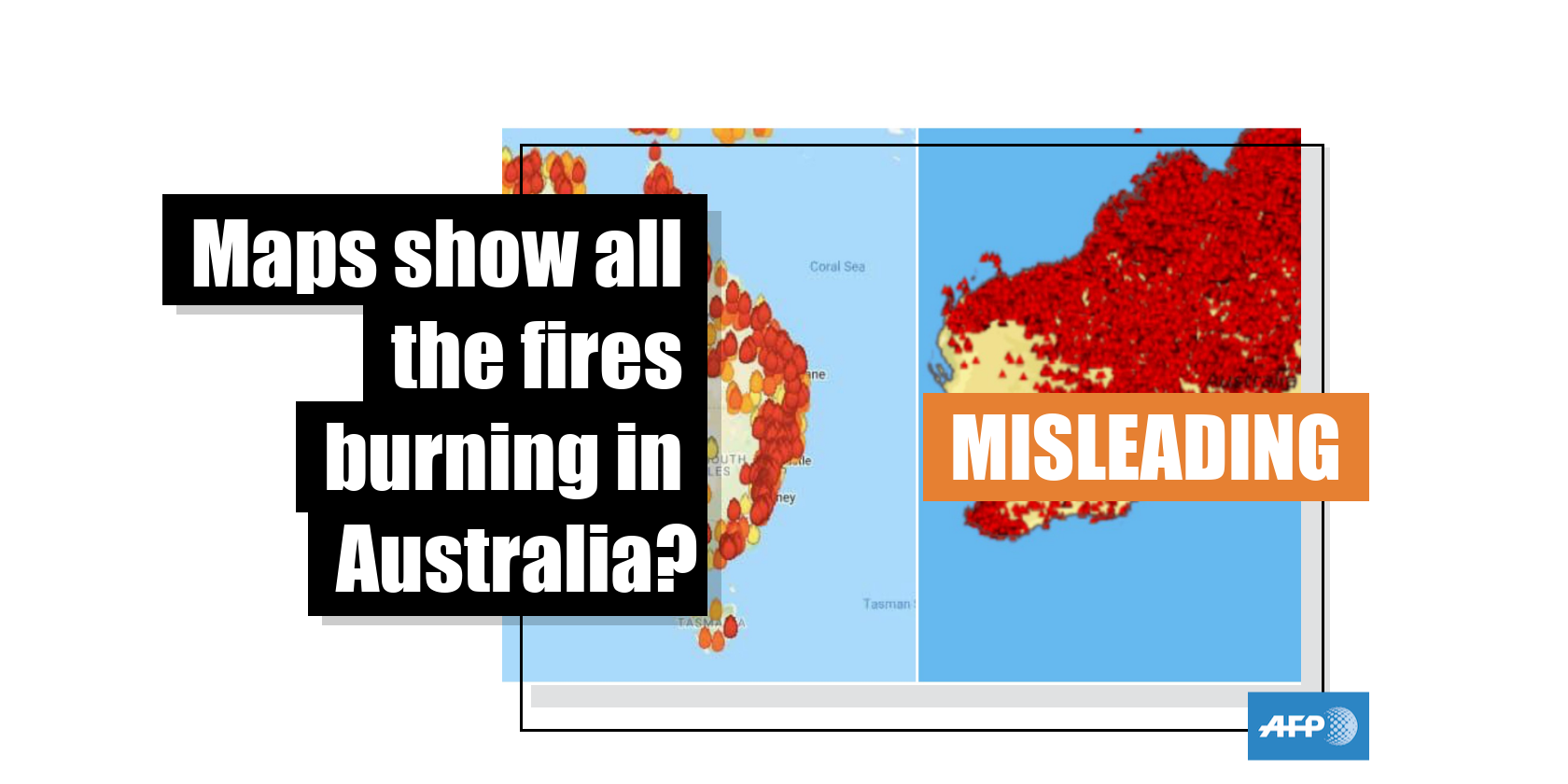
These maps do not show individual bushfires in Australia in January 2020
- This article is more than six years old.
- Published on January 10, 2020 at 03:35
- 4 min read
- By AFP Australia
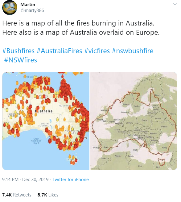
The first map, which shows scores of colored markers dotted across Australia, was published on Twitter here on December 30, 2019.
It has been shared more than 7,000 times
The tweet’s caption reads: “Here is a map of all the fires burning in Australia. Here also is a map of Australia overlaid on Europe. #Bushfires #AustraliaFires #vicfires #nswbushfire #NSWfires”.
Below is a screenshot of the misleading post:
The map has also been shared thousands of times on Facebook here; on Twitter here, here, here and here; as well as in online articles here and here alongside a similar claim.
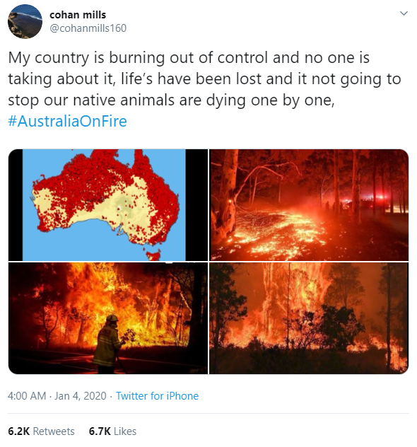
The second map, which is densely covered in red icons, was published here on Twitter on January 4, 2020. It has been shared more than 6,000 times.
The tweet’s caption reads: "My country is burning out of control and no one is taking about it, life’s have been lost and it not going to stop our native animals are dying one by one, #AustraliaOnFire”.
Below is a screenshot of the misleading post:
This map has also been shared thousands of times elsewhere; for instance on Twitter here, here and here with a similar claim.
The posts are misleading; Australia has continued to endure devastating bushfires, as reported by AFP here, but the misleading posts exaggerate the current situation and distort the regions still ablaze.
- First map -
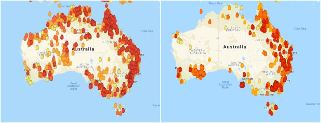
The shape and colours of the fire icons seen on the first map in the misleading posts are identical to those used by MyFireWatch, a Western Australian government site that provides information of heat sources around the country based on satellite data.
MyFireWatch displays heat sources that were detected in the past 72 hours and the different colours of the icons denote the time when the hot spot was detected, not the severity of the heat.
Below is a screenshot comparison of the map in the misleading posts (L) and the MyFireWatch live map from January 9, 2020 (R):
While the site is used as a reference for bushfires across the country, a disclaimer on the website states it does not exclusively show bushfires:
“The satellites detect any heat source that is hotter than its surroundings or looks hotter than its surroundings. This may include gas flares, refinery furnaces or highly reflective large industrial roofs.”
The variance is evident when comparing MyFireWatch to the current bushfires burning in New South Wales, the state that has experienced the most widespread devastation, as reported here by the BBC on January 8, 2020.
As of January 9, 2020, there were 122 fires burning in the state, according to New South Wales Rural Fire Service(NSW RFS)'s “Fire Near Me” map.
Below is a screenshot comparison of the same portion of southeast Australia on MyFireWatch (L) and NSW RFS website (R) at 1:25 pm AEST January 9, 2020:
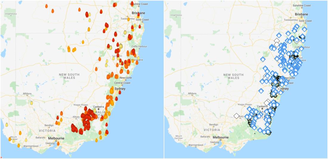
The blue symbols on the NSW RFS map represent the “Advice” level, the lowest on the fire service’s three-tier bushfire warning system, which indicates: “A fire has started. There is no immediate danger.”
The number of heat sources appears fewer on MyFireWatch, which can be explained by the following statement on its website:
“With automated methods of fire hotspot detection, not all hotspots are detected by the satellites. Some heat sources may be too small, not hot enough, or obscured by thick smoke or cloud.”
The website advised users to “not use this information to make decisions relating to active fires” and referred them to the emergency services in their respective states. Below is a screenshot of the message:

- Second map -
AFP found the same misleading map published on this Google site titled: “EARTH'S SYSTEMS WEB-BASED PROJECT ADELAIDE'S BUSHFIRE.”
The map is described as showing bushfire-ravaged areas in Australia between 1997 and 2008.
Below is a screenshot of the map on the Google site:
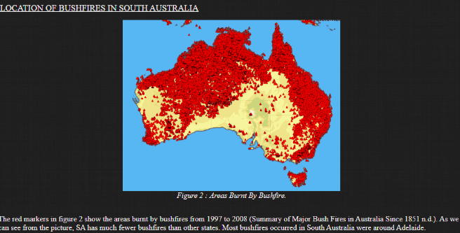
The image's caption states: "The red markers in figure 2 show the areas burnt by bushfires from 1997 to 2008 (Summary of Major Bush Fires in Australia Since 1851 n.d.). As we can see from the picture, SA has much fewer bushfires than other states. Most bushfires occurred in South Australia were around Adelaide."
A reverse image search on Google also found the same map published here on a blog on March 25, 2016 with a similar caption.
Using fire information mapped by satellite data from NASA's Fire Information for Resource Management System (FIRMS), AFP found the misleading posts which shared the second map inflated the scope of the bushfires.
AFP created an image that overlaid monthly fire maps for September, 2019, when the bushfires first erupted, as well as October, November, and December 2019.
The image shows bushfires were burning in fewer locations than what was marked in the misleading posts.
Below is a screenshot comparison between the map in the misleading post (L) and the image created by AFP (R):

AFP also created a sequence of month-by-month comparison using FIRMS fire maps between September 1, 2019, and January 9, 2020.
Copyright © AFP 2017-2026. Any commercial use of this content requires a subscription. Click here to find out more.
Is there content that you would like AFP to fact-check? Get in touch.
Contact us
