Old US election map misleads on voting trend in 2020 election
- This article is more than five years old.
- Published on November 11, 2020 at 03:58
- 4 min read
- By , AFP USA, Manon JACOB
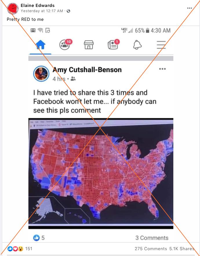
“Pretty RED to me,” reads the caption on a November 9 Facebook post shared more than 5,000 times, accompanied by a map of the US awash in red counties representing Republican votes.

The same screenshot has also been used in a meme here, on Twitter here and in other posts here and here.
A Facebook search showed that posts sharing the screenshot started circulating on social media as early as November 6, 2020, when the race was still very tight between the two White House candidates in battleground states.
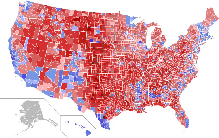
AFP Fact Check ran a reverse image search and traced the picture to a Wikimedia Commons page of county results for the 2016 US presidential election shaded by vote shares -- with exact matches in articles written prior to the election, such as here and here.

The above map went through several updates between November and December 2016, as the vote tally was updated.
By comparison, the first version of the Wikimedia Commons map for the 2020 county election results -- which was published on November 9 and updated on November 10 -- still contains gray areas, not matching the older version of the map that is circulating on social media.
An official fan page for former Donald Trump advisor Steve Bannon posted a map similar to the one in the posts two days after the election, on November 5. The map, also published on Wikimedia Commons, is based on the 2016 presidential election county results, colored in blue or red depending on the voting majority in each county -- last updated on January 4, 2017.

Although Georgia, Arizona, North Carolina and Alaska remain undecided, the 2020 election results appear very different from those of four years ago.
US president-elect Joe Biden has rebuilt the Democratic "blue wall" with victories in Michigan, Wisconsin and Pennsylvania. He is projected by some media organizations to have taken back Arizona and is leading in Georgia, two states last won by Democrats in the elections of 1996 and 1992 respectively.
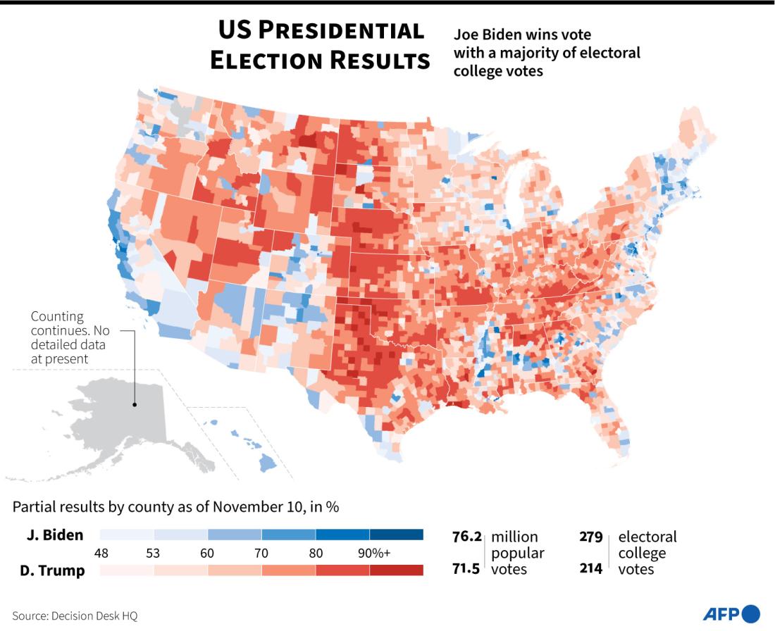
A more accurate representation of how people voted in the 2020 presidential election, as of November 10, can be seen in this AFP map, below.

Traditional US electoral maps are also misleading, Karim Douieb, co-founder of Jetpack.ai, a data science company based in Brussels, Belgium, explains on his website.
In 2019, Douieb worked on a data project about the 2016 presidential election results and compared how they could be visualized nationwide, depending on the different metrics used -- traditional maps, Electoral College maps, cartograms, and popular vote maps.
Although traditional maps “are the most geographically accurate representation of the election,” and speak to a majority of citizens who would understand cartograms with more difficulty, “they are not good at representing electoral importance,” Douieb told AFP via email.
Traditional maps “should be complemented by other types of representations,” he added.
The geographic surface area of the state of Montana, for example, is almost 17 times bigger than the state of New Jersey, the website gives as an example. "Acres don't vote, people do," it says.
New Jersey has 14 electoral votes as opposed to Montana's three. The latter also has one of the lowest population densities in the nation, while New Jersey has one of the highest.
For his project, Douieb “wanted to create an alternative visual where each county is represented by a dot sized proportionally to the amount of its associated voters, offering a much different reading of the situation. This arguably provides a better understanding of how the country voted,” he told AFP.
For the 2020 election, US media companies have also revisited ways to represent results on a map more accurately, such as with this Wall Street Journal cartogram that sizes states proportionally to their weight in the Electoral College, or this New York Times interactive map that focuses on the shift in votes compared to 2016.
US media on November 7 projected Biden the winner with 279 Electoral College votes against 214 for Trump, who falsely claimed that he had won, and has refused to concede.
This fact check is available at IFCN's 2020 US Elections #Chatbot on WhatsApp. Click here for more.
Copyright © AFP 2017-2026. Any commercial use of this content requires a subscription. Click here to find out more.
Is there content that you would like AFP to fact-check? Get in touch.
Contact us


