This map shows flight paths worldwide -- it does not show the movement of Wuhan residents
- This article is more than six years old.
- Published on February 18, 2020 at 08:20
- Updated on March 2, 2020 at 10:27
- 2 min read
- By AFP Australia
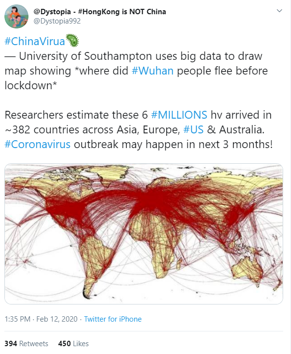
The map was published here on Twitter on February 12, 2020
The tweet reads: “University of Southampton uses big data to draw map showing *where did #Wuhan people flee before lockdown*
“Researchers estimate these 6 #MILLIONS hv arrived in ~382 countries across Asia, Europe, #US & Australia. #Coronavirus outbreak may happen in next 3 months!”
Below is a screenshot of the misleading tweet:

The map also appeared in a number of news stories citing a new study on the potential spread of the novel coronavirus, including UK-based newspapers Metro and The Sun; Australian newspaper The New Daily; Australian broadcaster 9 News; Australian news site News.com.au; Australian television show Sunrise; and the New Zealand-based newspaper The New Zealand Herald.
The articles attributed the map to the WorldPop project, a research team at the UK’s University of Southampton that focuses on population mapping projects.
The organisation published a study in January 2020, where it identified cities and provinces within mainland China, as well as cities and countries worldwide, that are at high-risk from the novel coronavirus.
As of February 18, 2020, almost 1,900 people have died and more than 72,000 people have been infected in China by the novel coronavirus, as reported here by AFP.
The map was also published in this Facebook post, as well as in tweets here and here with a similar claim.
The claim is misleading; the map does not show the potential spread of novel coronavirus based on the movements of residents of Wuhan, China, but actually shows flight routes around the world.
“You are correct, the map simply shows the global air network and the connectivity between countries using this form of travel,” a University of Southampton spokesperson explained by email to AFP on February 13.
“I think it was used as a general illustration in a tweet and somehow an incorrect story has spiralled from here.”
The map was shared on WorldPop’s Twitter account on February 5, as seen here on the Internet Archive, but was taken down, as per this clarification tweet by WorldPop.
The tweet states: “Concerns understood - simply intended to be an illustrative picture of the global air network, but we can re-post with a new image.”
The misleading map also does not appear in the study, which was last updated on February 5, 2020.
In response to the tweet deleted by WorldPop, Italian researcher Michele Tizzoni, an expert in data study, stated the map “only shows the air network worldwide” and “all those connections in red make it a little alarmist, without giving this explanation” about flight connections.
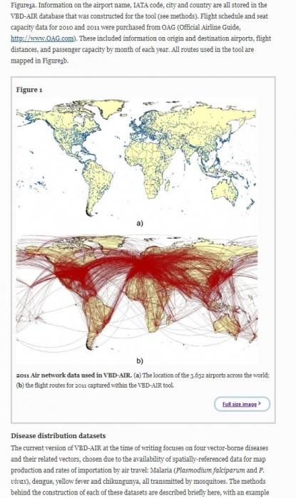
After being contacted by AFP Fact Check's Spanish-language service, Tizzoni, who is not involved in the WorldPop project, provided this 2012 paper as the original source of the illustration, where it states explained that the red lines were flight routes in 2011, drawn thanks to the VBD-AIR tool.
Below is a screenshot of the map:

The misrepresentation of the map was also highlighted by ABC journalist Kevin Nguyen here on Twitter.
This article was updated on March 2, 2020 to add comments from Italian researcher Michele Tizzoni.
Copyright © AFP 2017-2026. Any commercial use of this content requires a subscription. Click here to find out more.
Is there content that you would like AFP to fact-check? Get in touch.
Contact us
