Ice core graph used to make misleading global warming claims
- This article is more than three years old.
- Published on January 19, 2023 at 17:49
- Updated on January 24, 2023 at 14:27
- 4 min read
- By Feliks TODTMANN, AFP Germany
- Translation and adaptation Roland LLOYD PARRY
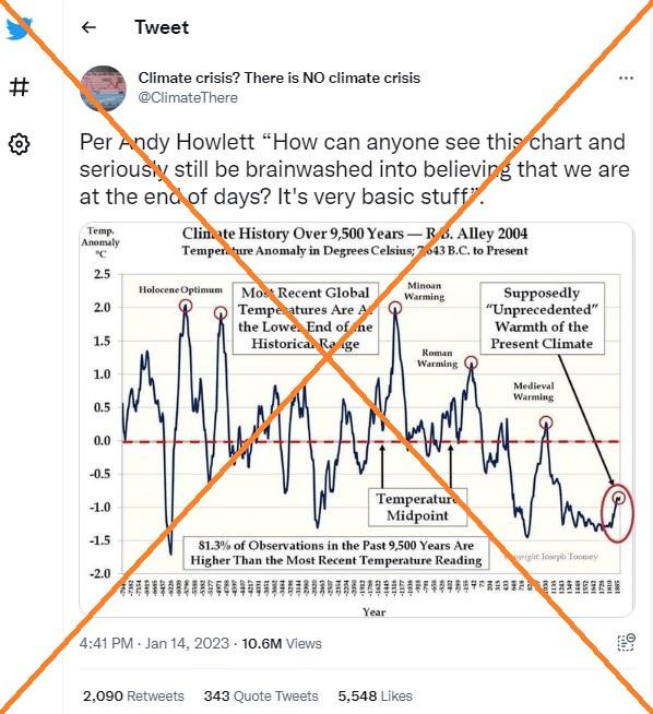
"How can anyone see this chart and seriously still be brainwashed into believing that we are at the end of days? It's very basic stuff," reads a message accompanying the graphic on Twitter that received 11 million views. It has also been shared on Facebook and in numerous posts in German.
The title of the graph says it shows temperature variations – the "temperature anomaly" – from "7643 BC to present", though the years along the x-axis run to 1885. It features several labels including one that reads: "Most recent global temperatures are at the lower end of the historical range."
It is dated 2004 and credited to Richard B. Alley, a geologist and glaciologist at Penn State University who has worked with the UN Intergovernmental Panel on Climate Change (IPCC).
Alley told AFP in an email that he had been receiving queries about the graph for more than a decade. He pointed out that the claim has been revealed to be misleading, including in a fact-check by specialist climate site Carbon Brief.

A detailed response by Alley to the claim was published in the New York Times in 2010. In it, he explained that the data in the graph were from the Greenland Ice Sheet Project 2 (GISP2), a drilling program by US research institutes that extracted ice cores.
"No single temperature record from anywhere can prove or disprove global warming, because the temperature is a local record, and one site is not the whole world," Alley wrote.
Stefan Rahmstorf, Head of Earth System Analysis at the Potsdam Institute for Climate Impact Research (PIK), said on Twitter on November 20, 2022 that the current graphic does not show the global average temperature and ends before the start of modern global warming.
He remarked that "there are many variants" of the claim by "climate deniers who post a palaeoclimate curve that doesn't show the global mean temperature (often it's Greenland) and ends well before modern warming."
Ice core data
Ice cores are a key source of information for palaeoclimatologists about the climate of past epochs – along with tree rings, stalagmites and sediments from lakes and oceans. GISP2 brought up a 3,000-metre-long core that contained information about the climate in Greenland over the past 110,000 years. These data formed the basis for numerous studies. Some of these reconstructed historical temperatures in Greenland over the past 10,000 years.
Among the key studies using GISP2 data is one by Alley published in 2004. In it, he describes, based on his analysis of the GISP2 data, how the climate of central Greenland has changed over past millennia.
Alley told AFP however that the data used in the graph originally came from a 1997 study by other scientists in the Journal of Geophysical Research. Data from their report were used in an article on a climate-sceptic blog site in 2010.
Bo Vinther, associate professor at the Niels Bohr Institute at the University of Copenhagen, told AFP that "no firm conclusions on Greenland's climate or Earth's climate can be drawn from these data" cited in the graph. He was the lead author of a 2009 study that reconstructed Greenland temperatures based on six different ice cores.
Timeline ends before current temperature rise
The timeline on the graph ends in the year 1885. The GISP2 data take 1950 as the date of the "present" epoch – a standard reference point for palaeoclimatologists and archaeologists, Alley explained. The earliest GISP2 data point is 95 years Before Present (BP) – the year 1855, according to the standard. Modern global temperature records show how the planet has warmed in the decades since. It remains unclear why the graph data end at 1885.
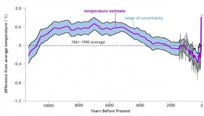
A 2013 study combining 73 historical temperature reconstructions from around the world with measurements from the more recent past shows a different curve from the one in the social media posts.
This graph shows that in some millennia it was indeed warmer on earth than today, but the right end of the line shows man-made climate change and the abrupt rise in temperature of the past few decades:

Scientists agree that humans are causing global warming by releasing carbon dioxide through the burning of fossil fuels.
"Much of Earth's history has been hotter than recently," dangerously hot for humans in fact, Alley said. Then, as now, high temperatures were driven by CO2.
"The high temperatures in those past times... were caused naturally, and the warming occurred at much slower rates than what we're doing," he said. "The current rise is not natural but caused by us."
In its major climate change report in 2021, the IPCC said: "Human influence has warmed the climate at a rate that is unprecedented in at least the last 2,000 years." It has warned in a 2018 report that the average global temperature rise could reach 1.5C in the coming decades.
IPCC reports provide the most comprehensive assessment of the state of Earth's climate.
"I frequently meet people who say, 'Climate has always changed naturally, so we should not worry about people changing climate,'" Alley said. " I have never met someone who said "People have always died, so we should not worry about murder.'"
Read all of AFP's climate-related fact-checks here.
January 24, 2023 Updated on January 24, 2023 to add a dropped word in the fifth paragraph.
Copyright © AFP 2017-2026. Any commercial use of this content requires a subscription. Click here to find out more.
Is there content that you would like AFP to fact-check? Get in touch.
Contact us


