
Misleading claim circulates online about infection fatality ratio of Covid-19 in the US
- This article is more than five years old.
- Published on October 8, 2020 at 09:30
- 2 min read
- By AFP Australia
The graphic was published on Instagram here on September 25, 2020.
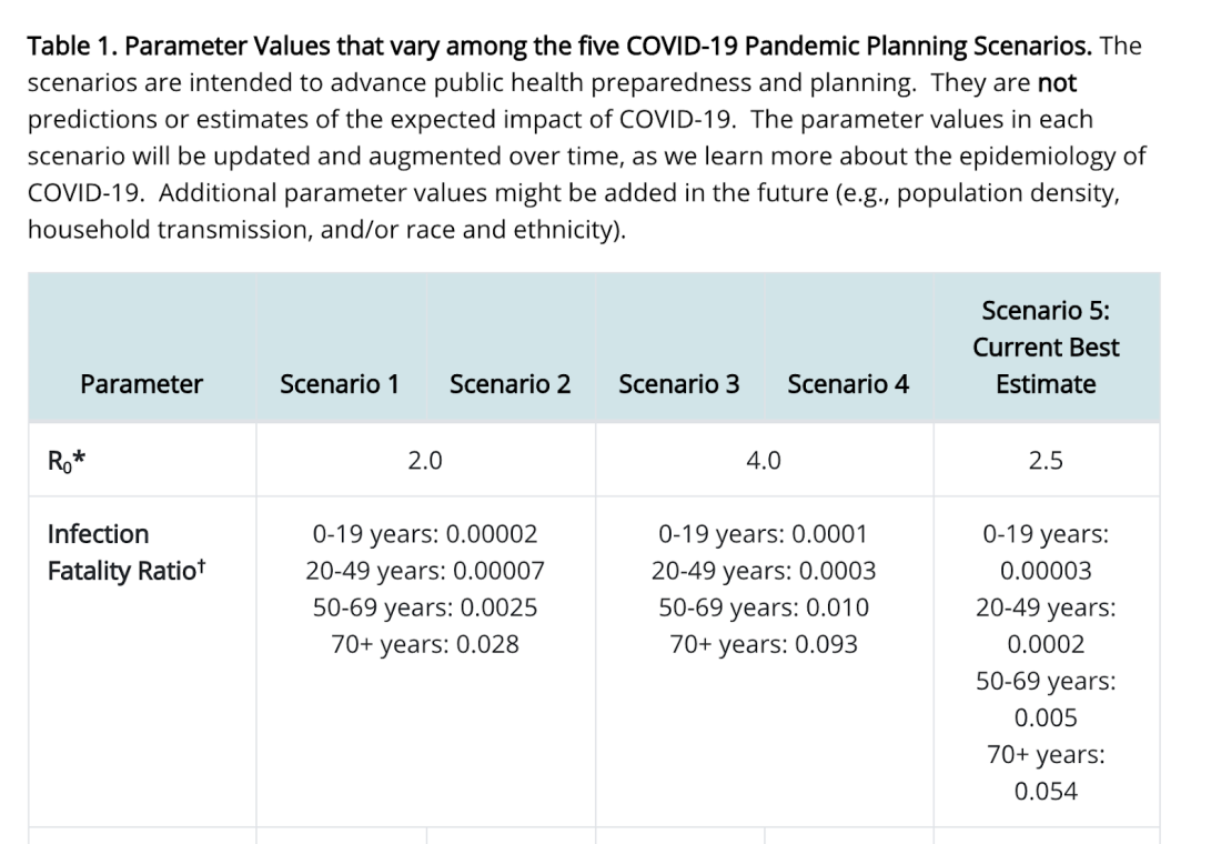
The graphic from US television network Fox News purports to show the infection fatality ratio (IFR) for Covid-19 as percentages by age groups. It cites the U.S. Centers for Disease Control and Prevention (CDC) as its source.
The graphic reads: “INFECTION FATALITY RATIO, IF INFECTED
"0-19 years - .00003%
"20-49 years - .0002% "50-69 years - .005% "70+ years - .054%”.

The Instagram post’s caption reads in part: “The truth is that this has never been a pandemic nor has it ever been about protecting people’s health. Quite the opposite. This has been about fear, control, $$$ and a new vaccine.”
The graphic was also published on Facebook here, here, here, here, and here alongside a similar claim.
The graphic, however, is not accurate.
The values in the graphic appear to be taken from this page on the CDC’s website. It provides the current best estimates for the coronavirus’ IFR, which estimates the “proportion of deaths among all infected individuals,” as the World Health Organization notes.
The CDC’s figures, however, were inaccurately displayed by Fox. The CDC notes that the values are in fact ratios, not percentages, for the “number of individuals who die of the disease among all infected individuals (symptomatic and asymptomatic).”
In response to the misleading posts, a spokesperson for Fox News told AFP by email the percentage symbols in the graphic were “shown in error” during The Ingraham Angle, one of Fox’s nightly convervative opinion shows, on September 23, 2020.
Theo Vos, a professor of Health Metrics Sciences at the Institute for Health Metrics and Evaluation, also said the Fox News graphic was inaccurate.
In an email to AFP on October 2, 2020, Vos said the purported IFR percentages seen in the graphic are lower by “a factor of 100 than the IFR reported by CDC”.
Copyright © AFP 2017-2026. Any commercial use of this content requires a subscription. Click here to find out more.
Is there content that you would like AFP to fact-check? Get in touch.
Contact us