Health experts say comparing death tolls of an emerging epidemic with longstanding diseases risks underplaying COVID-19
- This article is more than six years old.
- Published on March 17, 2020 at 05:30
- Updated on March 19, 2020 at 03:20
- 3 min read
- By AFP Australia
This Facebook post was published on March 11, 2020.
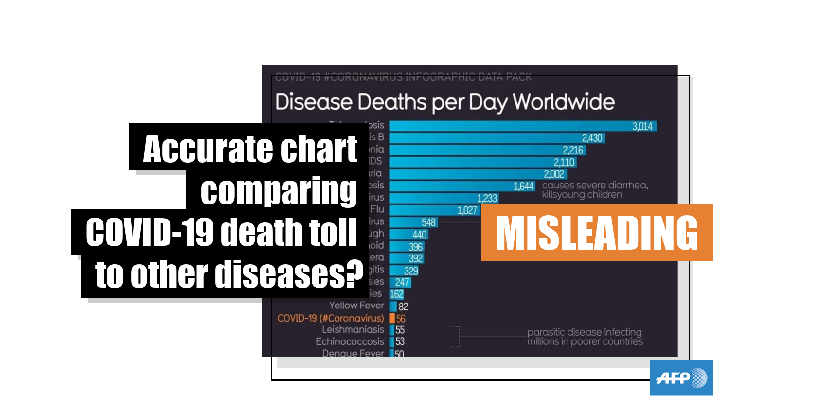
The post features a chart, titled “Disease Deaths per Day Worldwide”. It purports to compare daily mortality rates of COVID-19 and other fatal diseases, including tuberculosis, HIV/AIDS, and seasonal flu.
Below is a screenshot of the misleading post:

The chart is one of several graphics published by “Information Is Beautiful”, a website managed by the UK-based graphic designer David McCandless, which originally published the visualisation in a March 9, 2020 Facebook post here and on its website here.
The novel coronavirus, COVID-19, was first detected in the Chinese city of Wuhan in late December 2019. The virus has killed more than 6,000 people and infected 163,930 worldwide, including sports stars, celebrities and world leaders, AFP reported here on March 16, 2020.
The chart has also been shared here and here on Facebook; here, here, here, and here on Twitter with a similar claim. It was also shared in this Reddit post, where users debated whether it was reliable.
The claim is misleading; experts say it is misguided to compare a newly-formed disease such as COVID-19, which has a rapidly growing mortality rate, with other longstanding diseases.
--Rapidly spreading disease--
Brian Zikmund-Fisher, a risk communication expert at the University of Michigan School of Public Health, told AFP by email on March 13, 2020 that the misleading chart could mistakenly result in people perceiving the risks of COVID-19 to be minor by comparison to other diseases.
“Comparing a rapidly spreading disease to conditions which have stable prevalences is an unfair comparison, and it leads the audience to perceive the risk of SARS-CoV-2 as ‘low’ in gist despite its incredible potential to overtake all of these in a very short period of time. What we need (and I have seen) is more graphics showing the time trends,” he said.
Zikmund-Fisher questioned the choice of data used to create the graphic.
“Many of these graphics created by this organization are quite good, actually (e.g. those describing the differential mortality rates by age or by country). But the one you called out is problematic because the rest of the bars represent persistent rates of disease that are not changing much over time whereas COVID-19 infections are exploding exponentially at the moment,” he added.
“The same data in a table would still be true and still be misleading people's interpretation of how much they should be worried / act.”
According to the US Centers for Disease Control and Prevention, the history of tuberculosis can be traced back to 1882, HIV to the 1880s and seasonal flu to at least the 1930s.
--'Apples to oranges' comparison--
Carl T. Bergstrom, a professor of biology at the University of Washington, said the graphic makes an “apples to oranges” comparison.
“They compare the daily global mortality of SARS-CoV-2 [COVID-19] a disease that is just starting to take off and that was literally declared a pandemic only today, with the daily global mortality of endemic human diseases that have long reached maximum circulation,” Bergstrom told AFP in an email on March 12, 2020.
The World Health Organization (WHO) states COVID-19 was first detected in Wuhan, China on December 31, 2019.
The daily death toll for COVID-19 in the misleading graphic is reported as 56 and was "updated on March 9, 2020".
But in its March 9, 2020 situation report for COVID-19, the WHO states there were 225 new deaths reported in the 24 hours prior to its report; and on March 15, 2020, the WHO stated there were 343 new deaths in the 24 hours prior to the publishing of its report, suggesting a hike in mortality rate in less than one week.
This article was updated on March 19 to reflect that the chart was discussed on Reddit, rather
than shared with an identical misleading claim.
Copyright © AFP 2017-2026. Any commercial use of this content requires a subscription. Click here to find out more.
Is there content that you would like AFP to fact-check? Get in touch.
Contact us
