AI-generated Canadian wildfire maps obscure information on blazes' spread
- Published on July 23, 2026 at 17:14
- 5 min read
- By Gwen Roley, AFP Canada
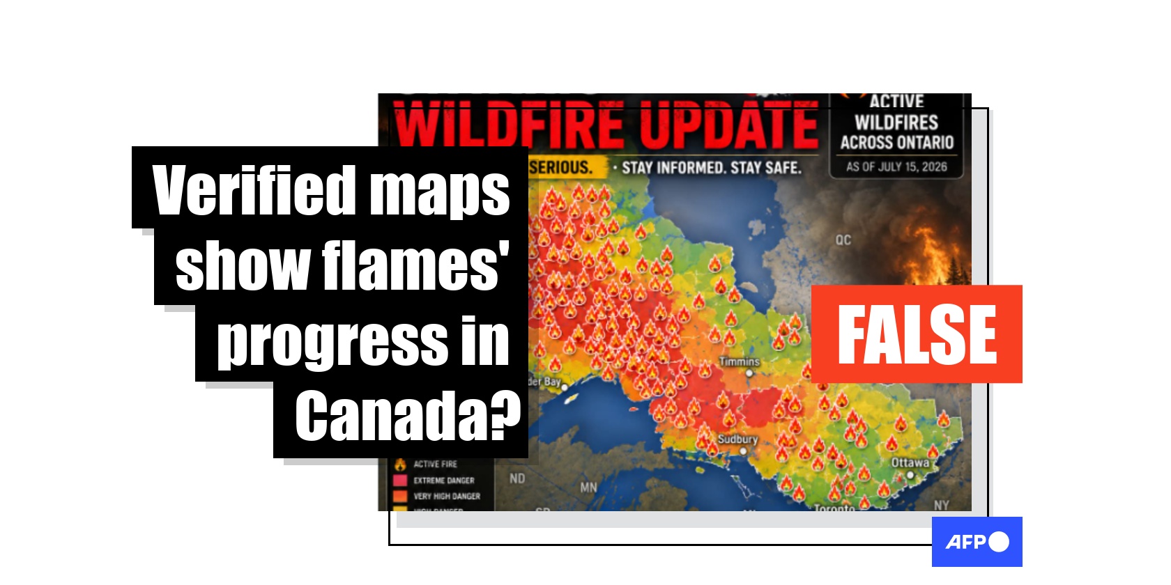
Government agencies and other organizations aggregate wildfire data into maps to communicate threat levels across geographical areas, but some AI-generated graphics on social media claiming to represent the situation are missing important context. The synthetic maps do not originate from verified sources, and experts told AFP they could give false impressions of where fires are burning without properly communicating the level of risk.
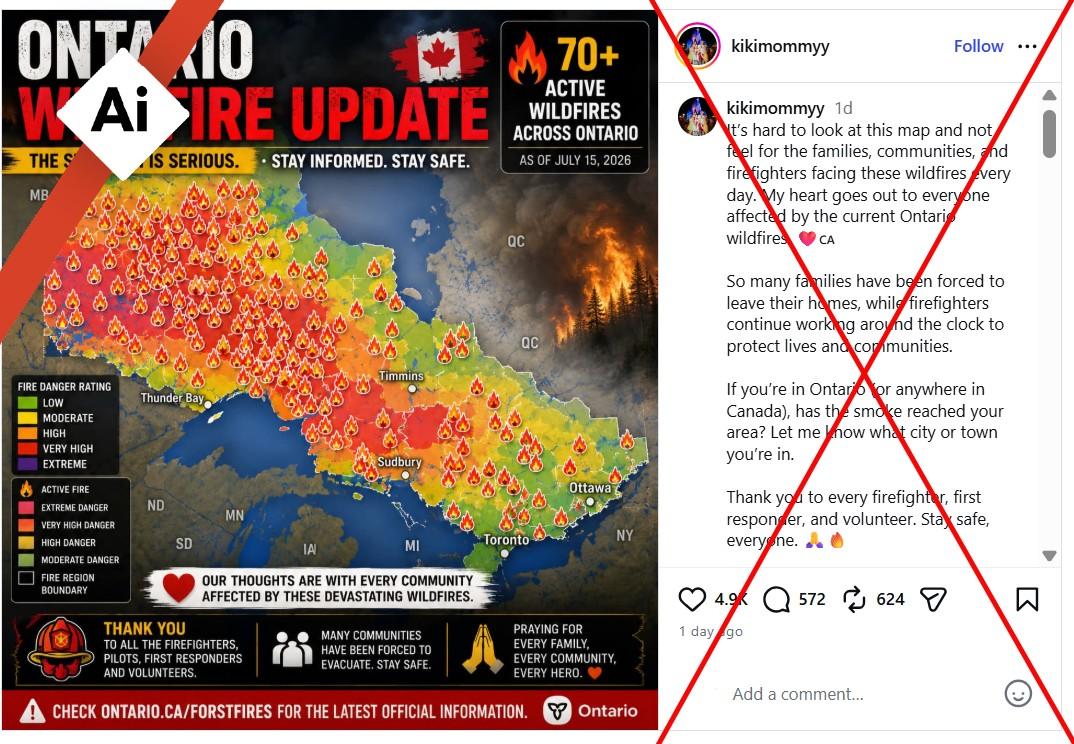
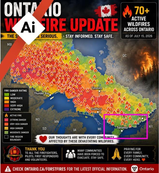
"It's hard to look at this map and not feel for the families, communities, and firefighters facing these wildfires every day," says the caption attached to one image shared July 15, 2026 on Instagram.
The visual purports to show the wildfire situation in Ontario province, with symbols and gradients supposedly representing the number of active blazes and level of risk. The post received thousands of likes.
Additional posts across Facebook, Instagram and Threads spread the same map, sometimes alongside claims that the wildfires were intentionally set to push people into 15-minute cities, evoking past conspiracy theories AFP has debunked.
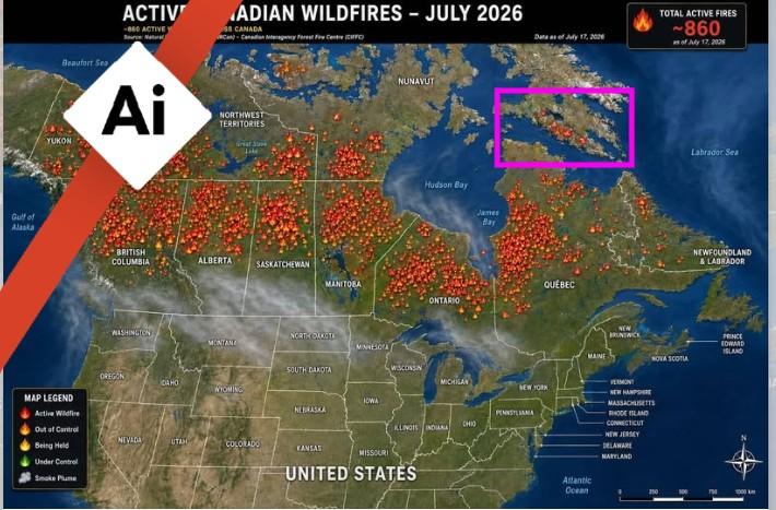
Other users shared similar maps supposedly representing flames nationwide, while a video allegedly showing satellite footage of the wildfires also circulated on Facebook.
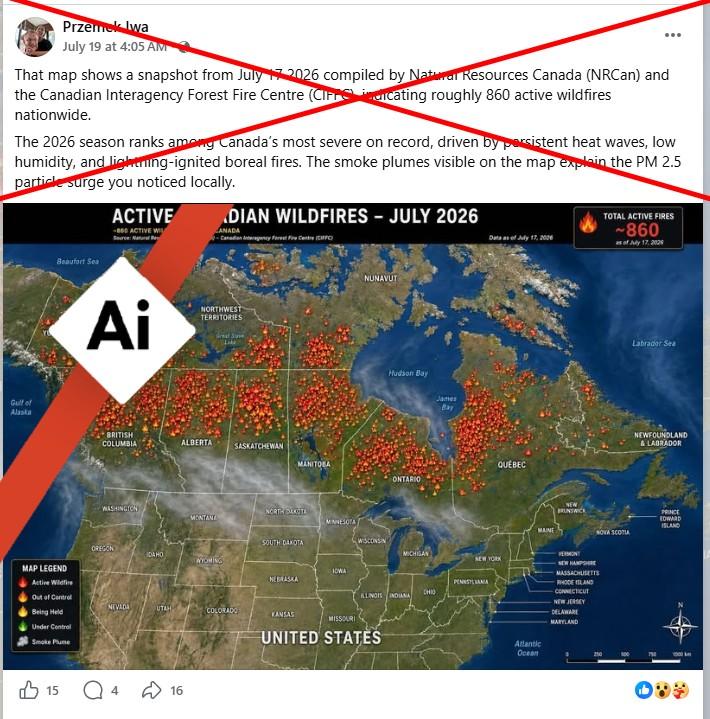
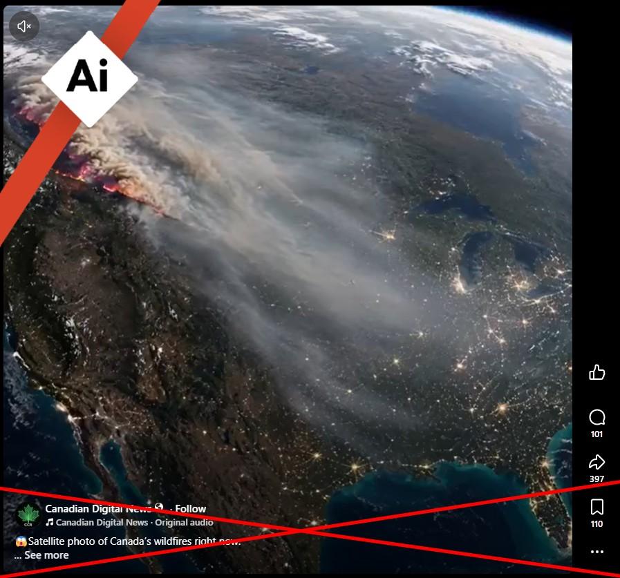
With nearly 1,000 active fires and an area as large as Belgium already burned, Canadian Prime Minister Mark Carney said July 18 his country is facing one of the "most intense" wildfire seasons in its history (archived here).
Barely halfway through the summer, virtually all Canadian provinces and territories have been affected. The largest fire, in Ontario, has forced mass evacuations and spread smoke as far as the US East Coast.
Provincial and federal governments, as well as news agencies and meteorological organizations, often share graphics to update on wildfire severity and smoke risk -- and the maps sometimes make their way on to social media feeds (archived here and here).
However, some of the graphics circulating online were generated using artificial intelligence and show inaccuracies, with bordering US states and other geographic areas mislabeled and some province shapes warped.
Some of the maps were already labeled with notices clarifying the use of AI, but many others circulated without warnings. AFP used the Hive Moderation tool to verify that the unlabeled images and the supposed satellite footage were generated with AI.
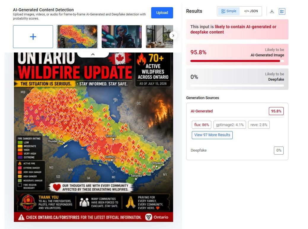
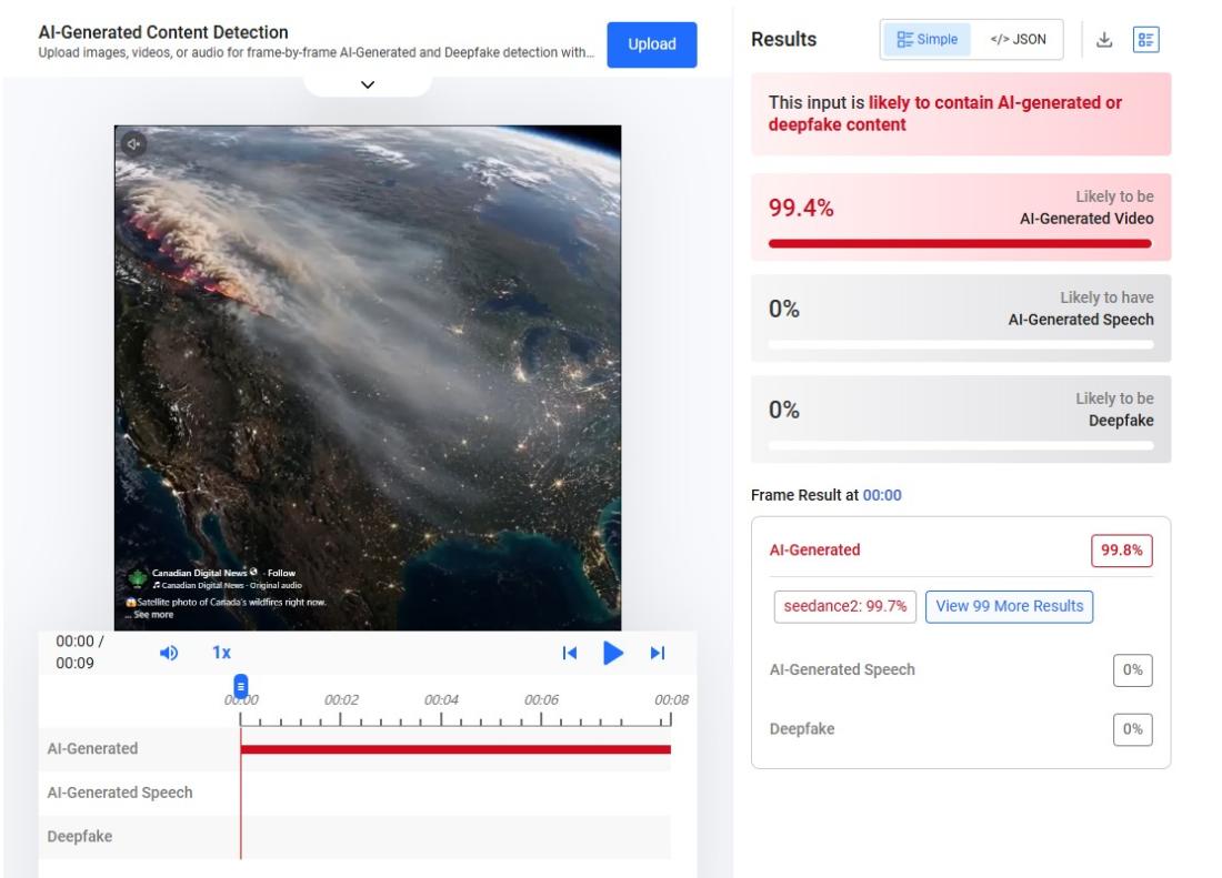
"These graphics can sometimes misrepresent the severity, location, extent or impacts of an event," said Michelle Brake, technical marketing manager at geographics software company Esri Canada, in a July 17 email (archived here).
Synthetic inaccuracies
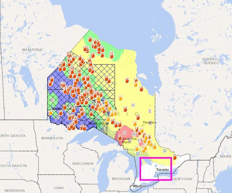
Comparing the synthetic map of Ontario with the province's official wildfire data uncovers details the AI-generated graphic misrepresents (archived here).
For example, in the AI maps shared mid-July, flame symbols appear to approach Toronto, but the provincial graphic showed no active wildfires near Canada's largest city as of July 17.
The fake satellite footage clip also depicted smoke coming only from fires in western British Columbia, when in reality much of the haze that carpeted North America could be traced to blazes burning in Ontario (archived here).
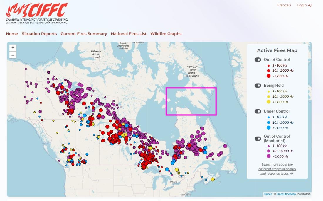
Another graphic claimed to show the wildfire data from the Canadian Interagency Forest Fire Centre and placed flames on northern Baffin Island, but the non-profit organization did not note any fires burning in that region as of July 22 (archived here).
Brake said AI-generated maps "may combine information from multiple sources, or fill in gaps with inferred or fabricated details, to generate a complete picture."
Brian Simpson, head of Wildfire Intelligence and Predictive Services with the Canadian Forest Service, added that the maps give a "false impression of how much area is actually burning" (archived here).
"One concern is that Canadians would look at those maps and think that they were threatened by wildfires that don't exist," he said in a July 17 email.
Engagement bait
Experts said authentic maps using verified data from satellites and hotspots more accurately represent fast-changing wildfire situations, as compared to AI models prone to hallucinations.
Chris Russill, academic director of the Re.Climate communication center at Carleton University, said AI has potential as an efficient crisis communication tool but was being misused to generate content for online engagement during disasters (archived here).
Visual content often misrepresents crises, he explained, pointing to a 2025 example of AI-generated wildfire pictures highlighted by the British Columbia Wildfire Service that did not accurately depict "the terrain, fire size or fire behaviour in the area" (archived here).
He said in a July 21, 2026 interview that the posts provided by AFP were the first he had seen of AI-generated maps produced in the context of wildfires.
Russill said the synthetic graphics skirted climate change's role and "reinforced" a trend where "the climate piece of the contribution to wildfires is kind of falling out of the conversation."
During past Canadian wildfire seasons, AFP has debunked numerous claims inaccurately blaming arsonists or directed energy weapons for wildfires.
Read more of AFP's reporting on misinformation in Canada here.
Copyright © AFP 2017-2026. Any commercial use of this content requires a subscription. Click here to find out more.
Is there content that you would like AFP to fact-check? Get in touch.
Contact us